Cleaning & property care
Neat&Tidy
Independent conceptWebsite design & build
Cobalt blue, yellow accents and sunlit photography bring a fresh feel to domestic cleaning. Open service rows lead into a planner for each home.
Explore the website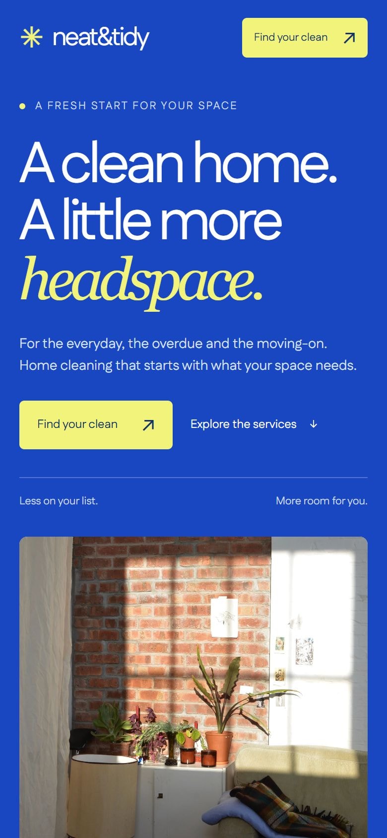
A bright identity for everyday care.
This independent cleaning concept gives the headline as much space as the interior image. A blue-and-white palette, yellow highlights and a recurring star-shaped mark form the identity, with thin rules organising the more detailed service information.
- Sector
- Domestic cleaning
- Focus
- Service discovery and interactive enquiry planning
- Project
- Independent concept
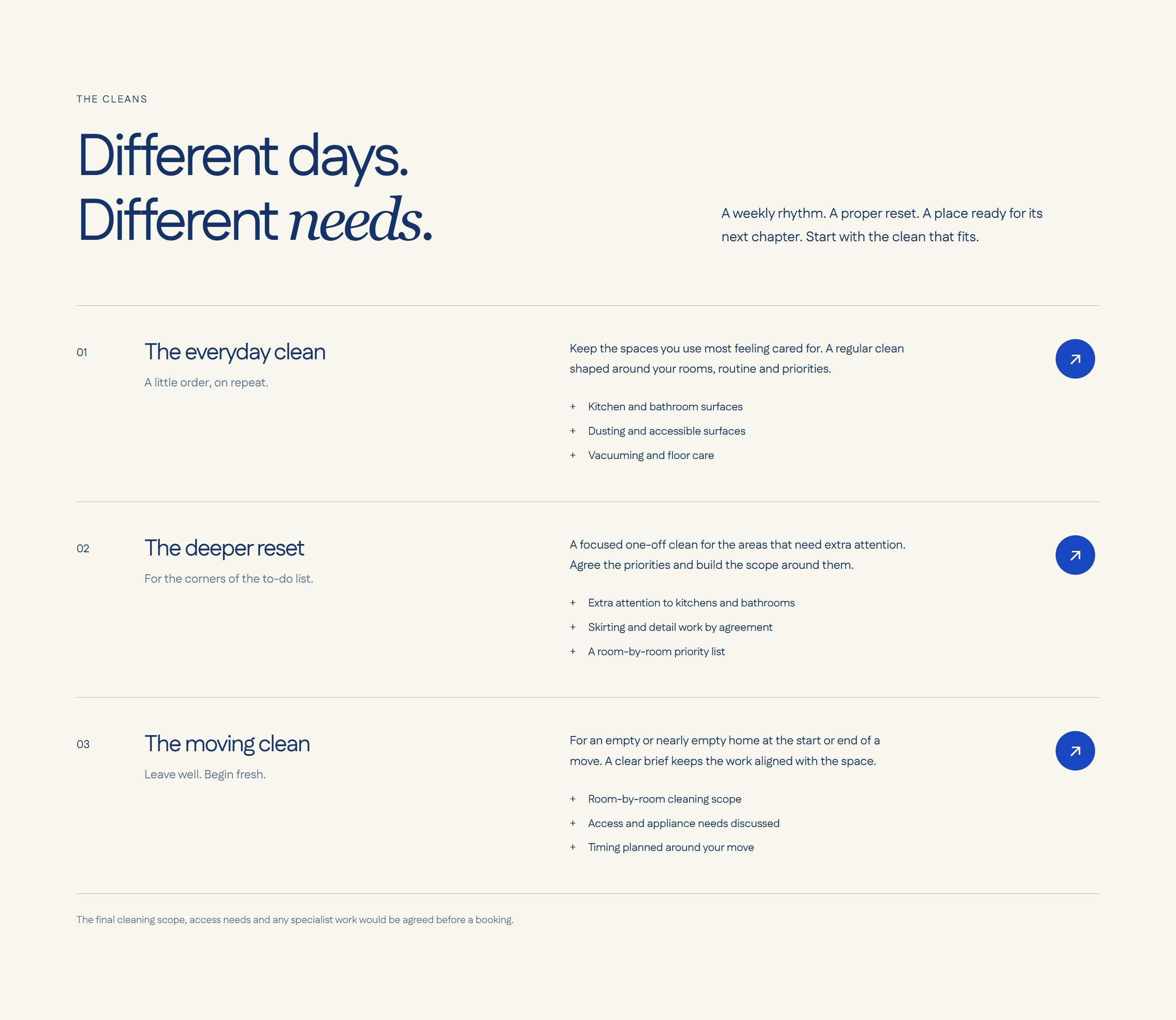
Service rows keep the comparison open.
Routine, deeper and moving cleans sit in full-width numbered rows. Aligned names, descriptions and arrow controls keep the scope of all three services visible together.
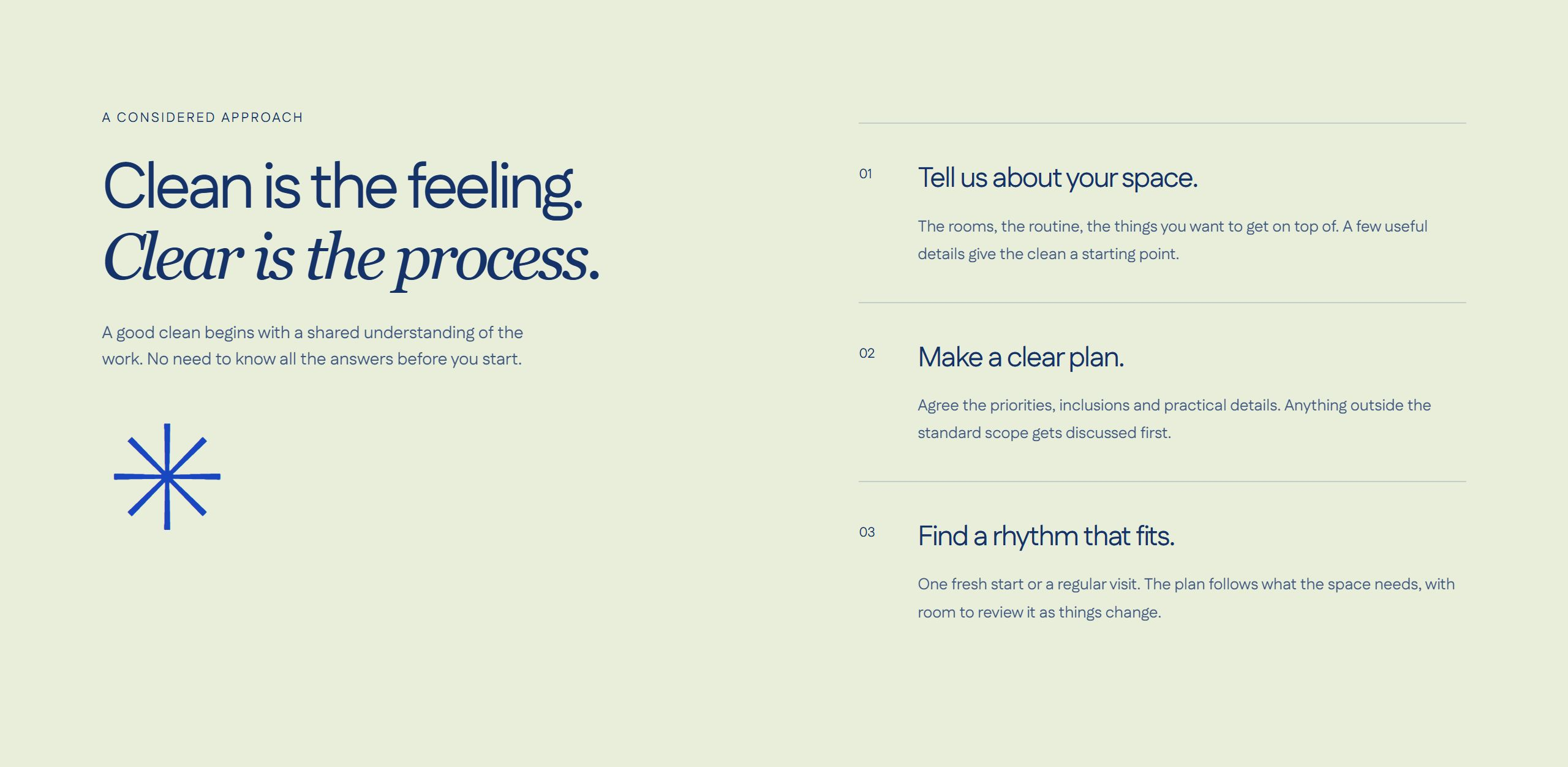
Sage separates the process from the offer.
A pale sage panel groups the three preparation steps beside an enlarged brand mark. The motion stays decorative: the mark can be paused and remains still when reduced motion is preferred.
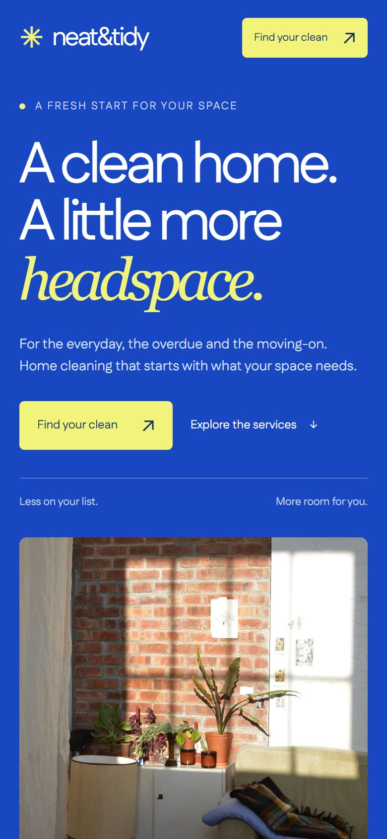
Reorder the layout, retain the identity.
On mobile, the headline and primary action precede the interior image. The blue-and-yellow palette and large type remain, while each service description moves beneath its title to preserve readable line lengths.
Yellow brings the brief into focus.
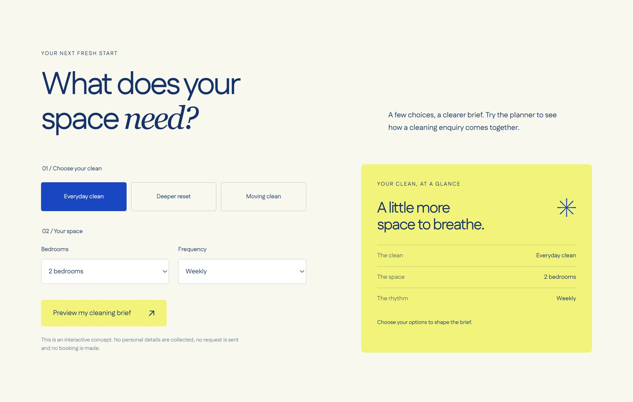
A yellow summary panel sits beside the service, home-size and frequency controls, showing the developing brief as part of the page. The working concept demonstrates enquiry planning using a local preview; it does not collect personal details or make bookings.
Have a website in mind?
Tell us what it needs to achieve, what already exists and where the current experience is getting in the way.
Get a free homepage mockup